We aim to respond to all messages within 1 business day. You'll be hearing from us soon!
In the meantime, perhaps you'd like to learn more...


Why Cross Device Testing Is Important To Us
You’ve all heard the saying, ‘you can’t be all things to all people’ right? Well in our industry that is something that we are faced with daily as we strive to be exactly that. We want the websites that we develop to appear as they were designed to look on all browsers and all devices – whether that’s a desktop PC, Mac, Laptop, Tablet, Phablet or Smartphone. It’s a tall order and one that we take very seriously.
Of course the reality is that our sites simply can’t display pixel perfect or function without error across every single browser, device or screen size ever released – and not just because the resource and expense that would go into that would be restricted by time and budget but also because we can’t control the human at the end of the device and their preferred (or most often unknown) settings. What we can do though, is ensure that we have a robust strategy that deals with website display on the most commonly used browsers and devices; taking into account the most common (default) settings. There are so many different configurations (Operating System, screen size, screen resolution, screen orientation, preferred browser and device) that we rely on market share statistics to tell us which configurations are most popular and we build, test and QC according to that data. Last month I talked about Why Cross Browser Testing Is Important to Us and this month I want to delve into Why Cross Device Testing Is Important To Us too.
Who’d have thought 10 years ago that we’d live in a multi device world where the internet wasn’t just available to us through our wired desktop PC or Mac but that we’d be carrying it around in our pockets and bags on our wireless smart devices in an omni-channel world? We’ve talked before about how fluid our industry is and the past 10 years have been the most fluid yet as we’ve adapted to these changes that have resulted in connectivity like never before.
So what are the devices that we build for and test our websites on?
I’ll start by mentioning that there are many, many emulators (software designed to show an approximation of what a website should look like in a given browser/device) and cross browser/device testing services available to website developers and QC teams. These are great and many do a lot of the heavy lifting that is required. We ourselves use emulators (and even built our own Responsive Website Tool) to check layout as it speeds up the build but we always, always test on the actual hardware post build and in the QC phase. Nothing comes close to the experience of viewing a website on an actual physical device as you also get to interact with the website and navigate it as a user would. We currently test on 14 (yes 14!) different devices before the website goes to the client for approval.
Here are a list of the devices we test on and some reasons why:
Desktop PC
In the office we are Microsoft Windows 10 users so we test on a range of desktop PCs all with multiple screen sizes ranging from 20” to 24” and resolutions of 1024x768 and 1366x768 (the two most popular). Our goal is to cover as many bases by testing on as many different configurations as possible.
Desktop Mac
Our designer uses an Apple Mac (of course!) and so full testing is carried out on a 27” screen. Apple products are sold with a feature called Retina display which is simply a brand name for screen resolution. The difference with Retina display is that the pixel density is so high that it is almost impossible to see the pixels up close – this gives the crisp display that Apple products are known for and is something else that we have to be mindful of when designing, developing and testing websites.
Laptop
There are a myriad of different laptop sizes sold by a myriad of manufacturers. We test on both 14” and 15.6” screens – these are fairly standard screen sizes and they are configured by default to a 1366x768 resolution.
Mobile/Tablet Operating System Market Share – January 2016
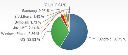
Source: Netmarketshare.com
As you’ll see from the image above, Android (Google) dominates the market share for tablet and mobile with 58.75% followed not so close by iOS (Apple) with 32.93% and Windows (Microsoft) coming in a distant third with 2.86%.
These stats lead us nicely into the mobile device testing that we carry out:
Tablets
iPad
As mentioned above Apple’s iOS operating system is second in line to Google’s Android when it comes to market share. iOS devices allow you to update to the latest version as they are released. This is a great feature as you know you’ll always have the latest version of the software installed (if you want it) and it makes it much easier for the build, testing and QC process as only one version of the OS needs to be considered – the latest one! We don’t consider older versions simply because updates are available for ALL users.
Windows Tablet
Market Share for Windows Tablet users is much lower than for iPad or Android but as it makes up one of the top three operating systems it simply can’t be ignored. Plus predictions are that Windows will be running on 18% of all tablets globally within the next three years. This is thanks largely to the release of Windows 10 – another reason for us to continue our testing on this device. We test on a Hewlett Packard tablet that, like our PCs, runs on Windows 10.
Android Tablet
We use a Samsung Galaxy Tab with an 8.0” display running KitKat version 4.4.2. Android devices have historically been shipped with a default WebKit browser that has been the bane of many a developer’s day. It is possibly the most unforgiving web browser ever! Thankfully Google (the company behind Android) saw the light and announced in 2012 that 4.0 and above Android devices would be shipped with Google Chrome starting with the Nexus 7. And although users with 4.0 devices released earlier than 2012 (Icecream Sandwich) have been able to download the Chrome browser and set it as default for some time, we have continued to support the WebKit browser due to the market share of those devices potentially still using this outdated browser.
Google do allow some users on older versions to upgrade to the latest version but not all and it isn’t something that is automatically pushed out like Apple do for iOS, so again we are always considering not just multiple devices but multiple operating systems and multiple browsers for Android.
Note: you’ll notice the words KitKat and Icecream Sandwich above. These are codenames that relate to the version number. More recently, Marshmallow (2015) and Lollipop (2014) versions were released and all previous versions have the name of a sweet treat – in alphabetical order.
Update February 2017:
We regularly check the market share held by the devices and browsers that we test on to make sure we are adhering to our goal to deliver quality, dependable websites.
The default WebKit browser mentioned above has dropped to just 3% market share this year so, we've decided it no longer makes sense to support this browser - a decision that our developers and our QC team are pretty happy about given that it has been the most unforgiving browser, in terms of website display, ever! We'll continue to test on this device but using Google's Chrome browser only.
Another thing we've noted is the rise of the Samsung Internet app which is now bundled as the primary browser on all of their current devices. Market share is creeping up (currently sitting at 10%) so we're now also testing on the Samsung Galaxy Tab S2 which has the new browser installed and have added that to our testing and QC list.
Mobile
We’ve got three types of people in our office – one firmly in the Windows camp (our Lead Developer), those in the Android camp (the Google supporters like our Digital Marketing manager) and those in the Apple camp (once you go Apple it’s really hard to go back!).
This diversity is great for us and our testing/QC process because we have multiple devices across all three operating systems to test on. We think we’ve got pretty much all bases covered here.
Android Phone
As per the section above on the Android tablet we need to consider not only the version of the operating system but the default browser. The great thing is that we have three different Android phones in the office all on different operating systems and all of which have the highest market share. We test on Jelly Bean 4.1 (22.4%), KitKat 4.4.2 (35.5%) and Lollipop 5.1.1 (34.1%). Two have WebKit as the default browser which is really useful for us and with the Chrome download it gives us another level of testing.
Windows Phone
As I mentioned earlier we, in the office, are Windows users on our Desktop PCs. And luckily for us, when it comes to testing, our Lead Developer is a Windows proponent and flies the flag for Microsoft with the sole Windows phone in the office. Market share is low and whether Microsoft can sustain its foray into the mobile phone market is yet to be seen – but while they have market share, we’ll continue to build for and test on Windows phones.
iPhone
Even with Android continuing to eat into the iPhones’ global market share, the iPhone is still second in line and has mass appeal. The battle between Google and Apple for market share will never be over and we’ll continue to test on this device for a long time to come. Like the iPad we run the latest version, 9.2.1 and only need to consider this version in our testing.
Once again I hope that this post offers some insight into the robust nature of our QC process and why it is so important to us, in our multi device world, that your website looks the best it can regardless of the device it is being viewed on. I’d love to hear from others who have an opinion on the importance of cross device testing so please feel free to comment below with your thoughts.
Disclaimer: Device stats are notoriously difficult to obtain due to the way that different sources interpret the data and calculate the stats plus the popularity of devices differs quite significantly by country. There are also biases when it comes to tablet vs. mobile data. I’ve offered my best efforts to give global statistics based on research from sitepont.com, gs.statcounter.com, netmarketshare.com and w3counter.com and this information is offered as a general insight into why we at Apex build for and test our websites in particular devices.

Written by Karyn Ogier
Here from the very beginning, Karyn was originally a co-founder of Apex Digital and carried the Strategy & Marketing Director title for more than two decades. Karyn switched gears at the end of 2018 when she returned to study in a new field. Now in a contract Content Writer capacity, she has a wealth of knowledge in the industry and has been...Related posts


AWESOME! LET'S GET STARTED
TELL US HOW WE CAN HELP
We aim to respond to all messages within 1 business day. You'll be hearing from us soon!
In the meantime, perhaps you'd like to learn more...