We aim to respond to all messages within 1 business day. You'll be hearing from us soon!
In the meantime, perhaps you'd like to learn more...


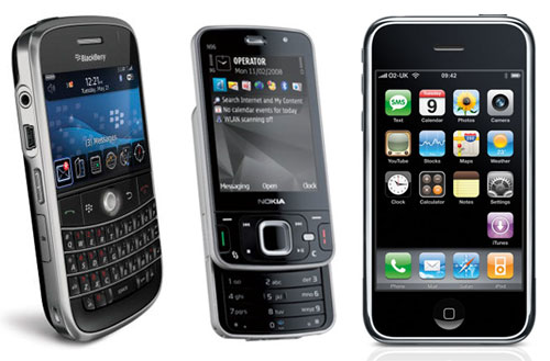
Preparing Your Website For The Mobile Web
According to Gartner (the world's leading information technology research and advisory company), by 2013 mobile devices will overtake desktop computers and laptops as the most common web access device worldwide. And while New Zealand’s smartphone uptake is slightly behind the rest of the world, the increased adoption of these devices cannot be ignored. As a consequence it’s becoming more and more necessary to not only consider these devices, but actually cater to them in your website design and build process.
When designing and building a website with mobile device access in mind, it’s important to understand that the user experience and goals of smartphone users differ to those of people using desktops/laptops. In particular you should give consideration to the following:
- The smaller screen size of mobile devices means that smartphone users are less likely to want to read large amounts of text. Furthermore, a smaller screen means that users may have to scroll more. Therefore it’s vital that your most important information is able to be seen quickly, clearly and without too much surrounding clutter. Be aware that a user interface (design) and content that works well on a desktop browser might not be so appropriate for a smartphone user.
- If your existing website contains elements of Adobe Flash technology it is likely that the Flash-based content will not be able to be viewed in mobile devices. Although this is changing with more smartphones now making allowances for Flash, generally speaking the user experience of Flash in mobile devices is poor and should therefore be avoided where possible.
Given the rapid increase in smartphone usage, businesses with websites will also need to accommodate smartphone platforms in order to further develop and enhance their web presence. To this end there are two main approaches:
- Create a ‘smartphone-optimised’ website that is tailored for mobile devices. Essentially this approach involves building a different version of your website that visitors using smartphone devices/browsers are redirected to automatically. Typically smartphone dedicated websites might feature reduced functionality and less text content than a typical website, but the beauty of this approach is that you are able to tailor the kind of content and how it’s laid out in order to ensure that visitors accessing your website via a mobile device will be presented with a much better user experience.
- Create a mobile “application" (also known as an ‘app’). In simple terms ‘apps’ can be considered versions of websites that are created specifically for a smartphone platform (such as iPhone or Android). By creating a device specific ‘app’ the user experience can be optimised to suit the user’s device, thus making it easier to use a specific service or achieve a specific goal via their mobile device. While developing an ‘app’ for your business can improve the user experience for smartphone users, it’s important to note that ‘apps’ are platform specific and as such you would need to develop (and pay for) multiple apps to be created in order to cater to the different mobile platforms that you want to be able to use it.
The option that is best suited to your business will depend on your budget, your target audience, and what it is you want to achieve with your website. As always there’s no one-size fits all solution, and each approach needs to be considered on an individual basis.
If you’d like to learn more about what’s involved in optimising your online presence for smartphone users then please feel free to get in touch – we’d be very happy to help you identify the best way of future proofing your online presence as we quickly move towards an online world dominated by mobile.

Written by Mark Vassiliou
Mark is the Manager of Digital Marketing at Apex and has worked in the digital marketing industry since 2004. Prior to joining Apex he worked in a variety of traditional marketing roles in both the corporate and SME environment in NZ and abroad, but these days much prefers the tangible measurability and transparency of digital marketing.Related posts


AWESOME! LET'S GET STARTED
TELL US HOW WE CAN HELP
We aim to respond to all messages within 1 business day. You'll be hearing from us soon!
In the meantime, perhaps you'd like to learn more...