We aim to respond to all messages within 1 business day. You'll be hearing from us soon!
In the meantime, perhaps you'd like to learn more...
Do you need a mobile strategy for your website?
New Zealanders’ adoption of smartphone technology continues to gather pace, with smartphones now making up somewhere in the region of 30% of all handsets in use in NZ1. What’s more, with NZ’s mobile providers now offering more realistic pricing options for smartphone handsets and monthly plans, browsing the web via mobile phone is rapidly becoming the norm for many New Zealanders.
Given the increase in mobile phone browsing in NZ it's time NZ business owners seriously consider how mobile is going to impact on their businesses and their ability to attract new customers via the web. It’s true that some industries are likely to have more pressing needs for considering their mobile strategy than others; restaurants, accommodation providers and rental car companies are all examples of industries where strong growth is being seen in the number of search queries coming via mobile/smartphone devices.
But what about your website? How do you know whether it's time for you to start taking your mobile audience more seriously? There’s no doubt you should at least be thinking about having a mobile strategy in place, but how do you go about determining just how much of a priority this should be? Fortunately, Google Analytics provides a built-in feature to help us learn about mobile use on our websites. Read on to find out how.
1 Vodafone NZ and IAB Mobile Advertising Council, 2012
Using Google Analytics to understand mobile use on your website
Unlike previous versions of Google Analytics, the latest version (v 5) makes it much easier to isolate mobile traffic from the remainder of your desktop/laptop based visitors.
When evaluating the need for a mobile strategy the first thing to look at is what sort of growth you’re seeing in the number of visitors browsing your site via a mobile device. Please note when looking for trends such as this it’s often best to consider traffic over a 12 month period or longer (if possible).
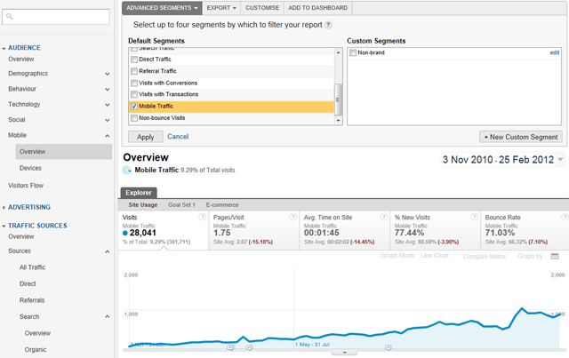
Once logged into Google Analytics the first step is to select the ‘Standard Reports’ tab. Then select the Audience drop down in the left hand column and select ‘Mobile’, then ‘Overview’. The next step is to apply the built-in ‘Mobile Traffic’ Advanced Segment by clicking on the ‘Advanced Segments’ dropdown at the top of the interface and selecting the ‘Mobile Traffic’ tickbox.

The resulting screenshot above shows that the number of visits to this site from mobile devices has been trending upwards over the past 15 months, with the number of mobile visits having increased from 100 visits per week to almost 900 visits per week in the space of 15 months – an increase of over 700%. Mobile visits are also contributing to over 9% of total visits to the site, hence there’s certainly enough evidence here to suggest that we should dig a little deeper and understand more about the way mobile users are finding and interacting with this site.
What are the main traffic sources for the mobile traffic to my site?
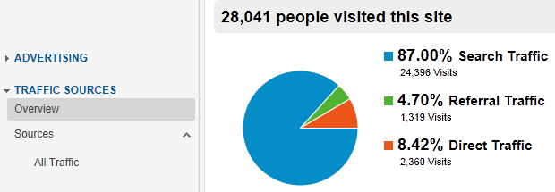
As part of your analysis it can be useful to understand how mobile users are finding or accessing your site. To do so, select the ‘Traffic Sources’ dropdown in the left hand sidebar and then select the ‘Overview’ menu item. Make sure you still have the ‘Mobile Traffic’ Advanced Segment ticked from the first step above.

From this view we can see that the majority of people accessing the site via a mobile device are coming to the site via the search engines. This gives us good grounds for drilling down deeper to look at how users with mobile devices are interacting with the website in comparison to visits from desktop/laptop visitors.
How do mobile visitors interact with my website?
When considering how mobile users interact with the site key things to look at are engagement metrics such as average time on site and pages per visit and bounce rate.

In the example above we can see that mobile visitors spend less time on the site, view fewer pages per visit, and also exhibit a higher bounce rate than the site average.
Bear in mind that while these metrics show that mobile users are seemingly less engaged, they don’t necessarily indicate a problem with the site as mobile users typically have different browsing/usage patterns to desktop users. However, what these metrics do confirm is that it is certainly worthwhile spending time to understand more about how mobile users are using the site, e.g. which content are they visiting most often, which content are they 'bouncing' from, what keywords are they using to find the site in the search engines and so on.
How do mobile users convert compared to desktop users?
Using the built-in Advanced Segments for Mobile Traffic we can also see that in addition to having lower levels of engagement, mobile users also exhibit poorer conversion metrics compared to desktop users.

It could be that the lead generation form for this site doesn’t render well on mobile devices, or perhaps the call to action button is not clearly visible when viewed on a mobile device. Perhaps the form is too long and too arduous for mobile users to fill in. Whatever the reason, it definitely warrants further investigation to learn why mobile visitors convert at a much lower rate than desktop visitors.
So, does this site need a mobile optimised web strategy?
Armed with the data we’ve collected above we’re now in a good position to determine how urgent it is for this site to take steps toward implementing a dedicated mobile strategy. Looking at the data we can see that:
- Over the past 15 months, mobile visits to this website grew by more than 700%.
- Mobile users are viewing fewer than average pages per visit.
- Mobile users have a higher than average bounce rate.
- Mobile users have a much lower than average conversion rate.
Based on the data above it’s pretty clear to see that now is definitely the time to take a serious look at developing a mobile strategy for this site.
Next steps
At this point a good next step would be to dig further into the specific types of mobile devices being used (all of which can also be easily found using Google Analytics) and identifying which mobile devices you are best to optimise the site for. Then you can start pulling your mobile strategy together, the details of which I’ll save for another post.
For the time being all that’s left for you to do is log into Google Analytics and find out what your site’s mobile specific metrics are telling you. With so much mobile related data available at your fingertips there really is no excuse for not understanding the scale and characteristics of mobile device use on your website. Only once you know where you stand you can take action towards delivering the best possible experience for visitors accessing your site via their mobile device.
Other useful reading and resources
www.howtogomo.com – a great tool from Google that lets you see how your site appears on a smartphone device.
Preparing Your Website For The Mobile Web - an introduction to the things you should consider before designing and developing a mobile version of your website.
Written by Mark Vassiliou
Mark is the Manager of Digital Marketing at Apex and has worked in the digital marketing industry since 2004. Prior to joining Apex he worked in a variety of traditional marketing roles in both the corporate and SME environment in NZ and abroad, but these days much prefers the tangible measurability and transparency of digital marketing.Related posts
AWESOME! LET'S GET STARTED
TELL US HOW WE CAN HELP
We aim to respond to all messages within 1 business day. You'll be hearing from us soon!
In the meantime, perhaps you'd like to learn more...


