We aim to respond to all messages within 1 business day. You'll be hearing from us soon!
In the meantime, perhaps you'd like to learn more...


How do I take advantage of Mobilegeddon?
April 21st was a significant turning point for mobile search results. In the first instalment Mobilegeddon: The Case for Mobile-Friendly Websites, I discussed Mobilegeddon, its purpose and its impact. In this instalment, I’ll take a look at the things that you can do to benefit from this change and make your site work for you in regards to your mobile users.
Just recapping.
Google, prior to the April 21 rollout, wrote:
“…we will be expanding our use of mobile-friendliness as a ranking signal. This change will affect mobile searches in all languages worldwide and will have a significant impact in our search results. Consequently, users will find it easier to get relevant, high-quality search results that are optimized for their devices.”[1]
Why is mobile-friendly the pinnacle? In short, with the Mobilegeddon update, mobile-friendly sites should receive favourable search rankings in mobile search. Note though that mobile-friendliness is only one criterion in Google’s search algorithm, so some sites that are not mobile-friendly can still rank – based off quality content etc. Remember Google’s focus is to still “provide the most relevant results, even if it's to a site that isn't optimized for mobile”. [2]
What makes a site Mobile-friendly?
Google[3] outline 4 criteria that are detected in real time by a Googlebot, which are used to deem a page mobile-friendly. These were:
- Avoid software that is not common on mobile devices, like Flash
- Sizes content to the screen so users don’t have to scroll horizontally or zoom
- Use text that is readable without zooming
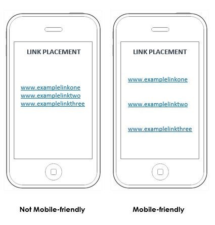
- Place links far enough apart so that the correct one can be easily tapped
I’d like to add two other elements to the list above, that being page load times and making sure your site can be fully indexed and doesn’t block Googlebot.
1. Avoid software that is not common mobile devices, like FlashThis isn’t just a discriminatory action against Flash and the like, it actually refers to the notion that many mobile devices do not support Abode Flash. If your site uses Adobe Flash, it is now more important than ever to avoid it. “HTML5 is now universally supported on major mobile devices, so if you require Flash-like elements, consider switching to HTML5 alternatives.”[4]
Software, like Adobe Flash, also impact upon page load times. This will be covered in more detail below.
2. Size content to the screen so users don’t have to scroll horizontally or zoomA mobile-friendly site/page is one where the content automatically resizes on the device, eliminating the need to scroll horizontally or having the user needing to ‘pinch’ the screen to zoom in to review content.
3. Use text that is readable without zoomingLike all other content assets on your page, the user experience is paramount and we don’t want them to have to use the zoom function on mobile to read text. This needs to resize automatically – the user should be able to load the page and start reading content straight away without having to manipulate the page in anyway (except to swipe down the page to read more!).
Another take home point for mobile-friendly results is to eliminate the use of fancy fonts. Stick with simple standard web fonts for mobile-friendliness – fancy fonts can also impact upon load times for mobile users.
4. Place links far enough apart so that the correct one can be easily tappedThere is nothing more annoying for a mobile user when they actually can’t select the link because it sits so closely with other links. Rather than being sent to the page they want to, frustratingly they are taken to another!
It is important to ensure that there is enough space between links, so that even those with sausage fingers can ‘hit’ the right link and complete their intended action.
5. Limit load times and make performance a goalIn terms of mobile-friendliness, one thing you need to take away from this article is that you need to review your website pages with page speed and load times in mind.
For better or for worse, we’ve learnt to become impatient; if you want to annoy your potential customers, simply make the ability to load content longer. Jowita Ziobro indicates that a page that takes longer than 4 seconds to load, will result in a minimum of 25% of people abandoning that page.[5]
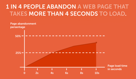
As observed above, increases in page load times will impact upon the drop-off rate of your site’s visitors.
“Page loading time is now one of the pivotal factors when it comes to mobile optimization, as according to Google - We must deliver and render the above the fold (ATF) content in under one second, which allows the user to begin interacting with the page as soon as possible."[6]
Briefly touched on previously is that of software. Some software, when accessed through mobile, serves up high load times and the user experience is severely impinged. The same goes for imagery (quality), and the use of video and audio.
When using imagery on your site – consider the balance between quality (resolution) and image dimensions, the relationship between these two factors can impact upon the load time of your images.
The same principle occurs for video and audio.
In a recent website build for our sister company, Limelight Online, the client was utilising a large video file that they wished to display on entry to the site. It was definitely something that would stand the site apart from its competitors, and most other sites, but the size of the video was detrimental to the user experience due to the load time. The solution? We created a snippit of the video that would load on page entry. This provided the ability for the ‘effect’ to still be realised, severely reduced load times and still gave the user the opportunity to watch the full version if they wanted to. Take a look at the result at http://www.greystonewines.co.nz/
It is good practice to have an alternative option for mobile if a desktop homepage uses video or audio content. By using static images for mobile you can eliminate any the delay in load time associated with video and any associated data charges that may be incurred as the page attempts to download.
6. Make Sure That You Haven’t Blocked JavaScript, CSS, or Image FilesIf a page is designed to work well on mobile devices, but it’s not passing the Mobile-Friendly Test, the most common reason is that Googlebot for smartphones is blocked from crawling resources, like CSS and JavaScript, that are critical for determining whether the page is legible and usable on a mobile device (i.e., whether it’s mobile-friendly). Google recommends that site owners allow Googlebot to crawl all resources for a page (including CSS, JavaScript, and images), so that we can properly render, index, and in this case, assess whether the page is mobile-friendly.
developers.google.com provide the following recommendations in regards to blocked JavaScript, CSS and image files:
- “Make sure that Googlebot can crawl your JavaScript, CSS and image files by using the “Fetch as Google” feature in Google Webmaster Tools. It will allow you to see exactly how Googlebot sees and renders your content, and it will help you identify and fix a number of indexing issues on your site.
- Check and test your robots.txt in Google Webmaster Tools.
- If you use separate URLs for your mobile pages, make sure to test both the mobile and the desktop URLs, so you can confirm that the redirect is recognized and crawlable.”[7]
If you don’t have a strong understanding of carrying out these functions, give the Apex Digital team a call and we can help you out with this.
What is Mobile-friendly - In Summary
Michael Liedtke of stuff.co.nz summarises mobile-friendly in a short paragraph.
“To stay in Google's good graces, websites must be designed so they load quickly on mobile devices. Content must also be easily accessible by scrolling up and down without having to also swipe to the left or right. It also helps if all buttons [including links] for making purchases or taking other actions on the website can be easily seen and touched on smaller screens.”[8]
Simplistic but yet accurate.
Is my site mobile-friendly?
The first step to take is to test your mobile pages with Google’s Mobile-Friendly Test to see if your webpage is detected as mobile-friendly.
This will provide you with a list of your site’s pages that are mobile-friendly and which pages aren’t. Remember, just because you homepage may be deemed mobile-friendly, doesn’t necessarily mean your whole site will be mobile-friendly.
If you want to make sure that your page meets the mobile-friendly criteria[9]:
- Check your pages with the Mobile-Friendly Test.
- Read Google’s Webmasters Mobile Guide on how to create and improve your mobile site.
- See the Mobile usability report in Google Webmaster Tools – this highlights the major mobile usability issues across your entire site, not just one page.
- Check out Google’s how-to guide for third-party software, for WordPress, Drupal, or Joomla etc. and follow the specific recommendations noted.
For some more ‘technical’ actions to undertake in regards to making your pages and site mobile-friendly, you can refer to:
So, what next?
If you’ve managed to tick off the above list, you’re now in good company. Functionally, your site is operating at the minimum.
When discussing mobile-friendly, a term often bandied about is that of responsive web design or RWD. But it is not the only option available to you – your options include RWD, a mobile site, adaptive design or mobile app. Let’s look at these in more detail.
A colleague, Mark Vassilou, discusses these approaches (with the exception of adaptive design) in a 2012 article Responsive Web Design Vs Mobile Website Vs Mobile App – Which Way To Go?
I recommend this as an extremely good read that delves into each approach, and the pros and cons of each.
Another article of interest (and of a broader nature) is that of Daniel Kedinger, You’re your Website Mobile-friendly Now; 3 Ways. Rather than advocating of undertaking specific actions mentioned previously to become more mobile-friendly, he holistically looks at three ways to ensure mobile-friendliness – a mobile website, the use of mobile plugins on popular CMS platforms – such as Wordpress, Joomla, or Drupal, and RWD.
Here at Apex Digital, we acknowledge that each approach has its time and place, but for us, as a best practice methodology, we advocate that all sites should be RWD. So what is RWD?
RWD refers to the way that designers think and construct page assets and their impact upon the user interface (UI) and therefore the user experience (UX). At Apex Digital, we’ve been huge advocates of RWD for a period of time, long before the Mobilegeddon update took place. Back in July 2012, one of our Director’s Karyn discussed RWD in her article The What, How and Why of Responsive Web Design.
“Responsive Website Design is the process of designing and building a website using techniques that allow the layout of the website to automatically adapt to fit the device it is being viewed on - be it on a desktop computer, a smartphone (such as an iPhone, Blackberry or any brand of phone using the Windows or Android operating system) or a tablet computer (such as iPad, Kindle Fire, Samsung Galaxy Tab or Google Nexus).
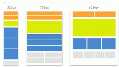 Figure 1: L-R: Smartphone, Tablet and Desktop Layouts
If you view a responsive website on a desktop monitor, you will see a full scaled version of the website. If you then view the same website on a tablet computer or smartphone, the information will automatically rearrange to become stacked, thus enabling you to see a streamlined version (as per Figure 1 above). Responsive websites remove the need for scrolling or panning to access information, thereby improving the user experience and making it easier for a smartphone user to view your content, make an enquiry, or find important information on your website.”[10]
Karyn Ogier, Apex Digital
Part of the RWD process is the acknowledgment of those things, assets and functions that impact upon a page and the sites’ mobile-friendliness and designing (and developing) accordingly. i.e. avoid software that is not common on mobile devices, like Flash; size content to the screen so users don’t have to scroll horizontally or zoom; use text that is readable without zooming; and, place links far enough apart so that the correct one can be easily tapped.
The RWD process will also address load times, asset sizes, and user-ability/experience. Factors such as simplifying navigation, designing for fingers, optimizing images, the use of SVG and reducing load time (finding the balance) are all at the forefront of the design process.[11]
Oh, and did I mention that Google Loves RWD? Plus having only one website means that you can consolidate your efforts around your Digital Marketing campaign.
It’s not just about design, but also content.
In regards to content with mobile users in mind, the focus is on clear and concise headings/titles, short paragraphs of content, and prominent call to actions.[12] Remember, screen real estate is at a premium so the use of white space and the ability to relieve the eye amongst a content block is vital in maintaining interest. And don’t forget about good SEO just because it is mobile you’re focusing on! Just as important on mobile or desktop, you still need to:
- Create and maintain Meta descriptions that stand out
- Integrate important keywords in your content as appropriate
- Format your headings in an SEO-friendly way
- Choose and optimize images and tags
How long before you’ll be mobile-friendly ranking?
Google’s algorithm operates in real time, so you should see the fruits of your labour to become more mobile-friendly within a short period of time – some early tests indicate that this can take a few hours up to over 72 hours ‘if you do everything right for Google to show your web pages as mobile friendly’. [13]
Summary
Google is now using this label (mobile-friendly) as a ranking factor across all languages worldwide; the update applies to individual pages, not entire websites. As a result, searchers get “high-quality and relevant results where text is readable without tapping or zooming, tap targets are spaced appropriately, and the page avoids unplayable content or horizontal scrolling.”[14]
In this article we have discussed valuable tips on identifying whether your site’s pages are mobile-friendly and what you need to do in order to ensure they are mobile-friendly. These are the fundamentals for each page but the efficient, individual optimization of content and performance for mobile requirements goes far beyond this.[15]
Citations:[1] http://www.dtelepathy.com/blog/design/responsive-or-bust-googles-focus-on-mobile-how-to-design-for-it
[2] http://money.cnn.com/2015/04/21/technology/google-mobilegeddon/
[3] http://googlewebmastercentral.blogspot.co.nz/2014/11/helping-users-find-mobile-friendly-pages.html
[4] https://gtmetrix.com/avoid-flash-on-mobile.html
[5] https://medium.com/@jowitaziobro/7-future-web-design-trends-fba93eba6355
[6] http://www.clickz.com/clickz/column/2405663/10-steps-to-a-google-mobile-friendly-site
[7] https://developers.google.com/webmasters/mobile-sites/mobile-seo/common-mistakes/blocked-resources
[8] http://www.stuff.co.nz/technology/digital-living/67872734/Google-shaking-up-search-recommendations-on-smartphones
[9] http://www.clickz.com/clickz/column/2405663/10-steps-to-a-google-mobile-friendly-site
[10] https://www.apexdigital.co.nz/blog/the-what-how-and-why-of-responsive-website-design/
[11] http://www.dtelepathy.com/blog/design/responsive-or-bust-googles-focus-on-mobile-how-to-design-for-it?utm_source=sendgrid&utm_medium=email&utm_campaign=moztop10
[12] http://searchenginewatch.com/sew/how-to/2405740/6-content-tips-for-adapting-to-the-post-mobilegeddon-world
[13] http://searchengineland.com/tomorrow-is-mobilegeddon-are-you-ready-for-the-google-mobile-friendly-update-219291
[14] http://venturebeat.com/2015/04/20/googles-mobilegeddon-everything-you-need-to-know/
[15] http://blog.searchmetrics.com/us/2015/04/16/google-mobile-update-everything-you-need-to-know/
Related posts


AWESOME! LET'S GET STARTED
TELL US HOW WE CAN HELP
We aim to respond to all messages within 1 business day. You'll be hearing from us soon!
In the meantime, perhaps you'd like to learn more...