We aim to respond to all messages within 1 business day. You'll be hearing from us soon!
In the meantime, perhaps you'd like to learn more...


What's inappropriate for a website? The Dirty Dozen.
I had just parked up the car and was about to begin the short walk to work when the weather gods thought they would play an evil and unexpected trick. The wind factor was already above anything that I would expect in New Plymouth, and much like the rest of the week, the weather forecasters had got it wrong once again and rain was threatening.
You can imagine my surprise as I put on an outer jacket and rugged up, when a young woman stepped out her vehicle 30 metres ahead of me. Her being completely inappropriately dressed for the weather and the walk to work, and possibly borderline appropriate for any work place, I began the walk to the office. Quickly in pursuit and overtaking her due to the impact those high heels were having on her land speed, I was a little relieved as the wind was starting to play havoc with her choice of attire.
Lost in my own thoughts for the rest of the walk and attempting to thwart the wind, the brain skipped a process or two and I started to think about those things that are inappropriate on a website. Weird jump huh?
Well after a little discussion around the water cooler, it became apparent that there are a number of different things that can be on a website that are completely 1980s and totally inappropriate for all businesses today.
Shortened and labelled the ‘dirty dozen’, here are 12 things that our team have identified as completely inappropriate for your website.
The Dirty Dozen Unleashed
1. Content Confusion
There is nothing worse on a website than it looking like a noticeboard – a place where you have to filter through the different content elements and try and find some cohesive understanding from the plethora of information on it.
What can even be more confusing are the variety of ‘calls to action’ that can be displayed on one page. What do you want me to do – Call you? Contact you? Subscribe to your newsletter?
Use the KISS technique – keep it simple stupid. In terms of content, make sure it is structured and has a purpose. Your website shouldn’t be a dumping ground for all that you know or all that your business does – be strategic about what goes on it, where it goes and how best to demonstrate your experience and expertise amongst the not so important content.
Have a purpose. Be clear on what you want your website to do and achieve. Extend that thinking to each of your pages and ensure that your call to actions are aligned to the desired outcomes of the site and each page.
Employ the services of a content strategist, if need be, to get the understanding of how best to structure your content. It is money well spent as instead of a visitor coming to your site for answers and getting confusion, you’ll be able to meet their needs in the shortest period possible with everything simply located and intuitive to find.
2. An identity crisis
Leading on from the above in regards to confusion, is a website that has no idea of what it is! How many sites have you gone to where you’re not sure of what the site is supposed be?
We would all like to think that our website has a clear identity but often or not, we are throwing everything at one site expecting it to be multiple things to multiple people. This can be achieved through great information and website architecture, but without spending too much money delving into this, simply ensure that your content and calls to action are aligned with the main purpose of the website.
Just think, are you an e-commerce site (selling something to someone online), is your main purpose to educate, is it to gain followers etc. and make sure that this is the dominant feature of your site.
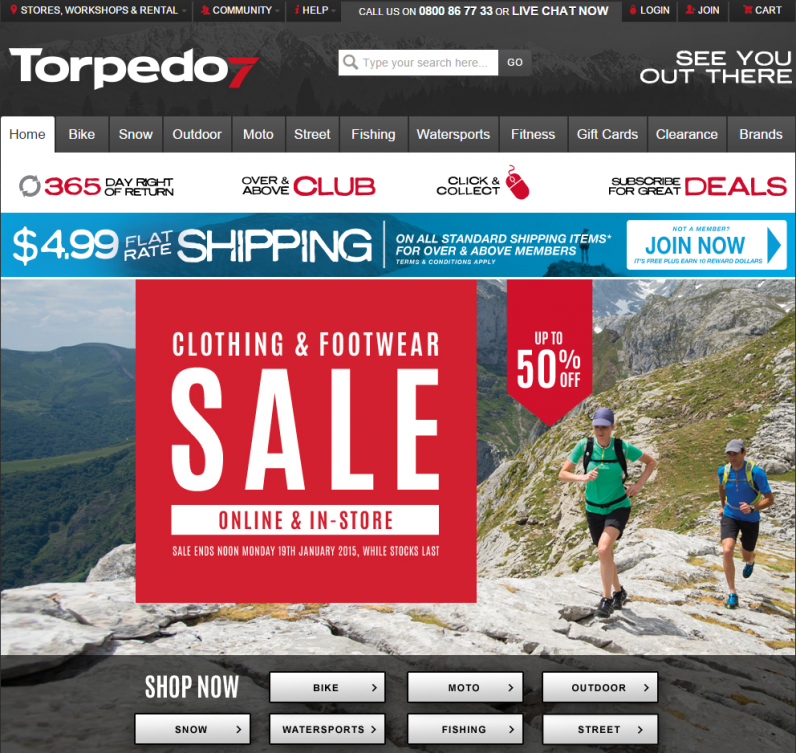
A good example of a site that knows who it is, is Torpedo 7 – What do you think their business is?
3. Links
Discussing links could potentially extend our list of 12 to 15, but we’ll cover them off in one go here.
Poor linksIn the SEO world, in days gone by, there was a significant benefit in having numerous links to your website in order to move it up the search rankings. Many ‘link acquisition companies’ offered package deals of a 1000 plus links for a price, with a promise of immediate ranking benefits. With the evolution of the Google algorithms, the notion of link volumes has been down-graded and the quality of links valued higher.
The problem with the 1000 plus link offers is what? You guessed it, quality, or in this case, a lack of it! Without quality links, search engines are not going to see your site as one to feature within in their search results. Subsequently, poor links and at especially high volumes, will have a detrimental effect on how your website is seen in the eyes of the Internet marshals.
Linking is not as easy as just purchasing them! It requires hard work, networking and becoming an expert in your field. By increasing your presence, people are more willing to connect and link to you from their own websites, thus building your and your websites’ own credibility.
Broken LinksEver gone to page to get a 404 error – i.e. this page cannot be found. A sure fire way to annoy a visitor, especially if you have just clicked a call to action (CTA) button and it has taken you to a non-existent page.
Take the time to ensure that your website is functionally sound, and fix any navigational issues as they arise.
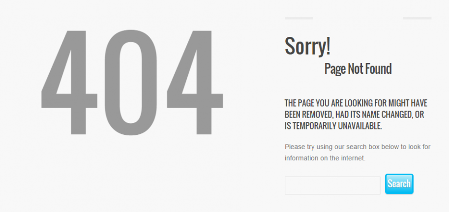
In addition, treat your 404 page as another potential opportunity to point the user in the right direction. For example, within the 404 page provide links to your products and services pages, learn more about the business by including a link to your About Us page, or at a minimum, a direct link to the homepage. A 404 message like the above says there is an error, but it doesn’t make the transition for the user to navigate your site easy – which means they may just leave the site.
External links opening in the same windowA good practice is to ensure that all links to external websites open in another window. Having an external link open in the same window is simply the best way to send visitors away from your site! Why would you point a visitor to someone else’s website and have them lose access to yours? Unless of course you have an agreement for referrals – but we doubt it.
At Apex Digital we put each of the websites we build through a rigorous quality control process where our team test everything, so you can expect that you won’t get any link-issues while you’re working with us. We believe there is nothing more prudent than to test a site to ensure all links point to the correct location and open in the right places! We’d be happy to review your current site, identify any broken links and fix them for you.
4. Advertising
There is nothing worse than visiting a site that is proliferated with advertising – banner ads, pop up ads, contextual ads – yuck!
Numerous adverts can be distracting and interrupt the design of your own webpage. Even worse, by having them on your site, you’re then inviting people to leave your site, even after you’ve tried so hard to attract them in the first place.
5. Imagery
They say that a picture is worth a thousand words right? We’ll don’t make those words be – yuck, gross, naff, childish or boring. Make sure that like your content, your imagery has a purpose, adds value and is of a high quality. An image should match the ‘tone’ of your site and support the content. Don’t let it drag down the importance of the content by saying something completely different to what your text says!
The second point to note around imagery is to make sure that it actually belongs to you – unless you have paid for the image and you are able to use on your site. Pilfering someone else’s images may add some value in the short term but the ethical way is to reproduce the image in a unique way.
The hiring of a professional photographer can ensure that you get top quality imagery and portray the right message. Alternatively, you can use graphic designers to create well-presented infographics and imagery to help your site look more professional and add credibility.

6. Bad content or a lack of content
I’m sure we’ve all visited a site and just thought ‘What the?”
Poor content, irrelevant content or just a complete lack of content are all turn offs for anyone visiting your site.
The current thinking in regards to Content Marketing is that there is more and more emphasis being placed on the development of good, unique content that is adding value. Just like when you’re having a conversation with people, there are things that will make you want to run and dig yourself a quiet hole, or at times think ‘we’ll never get those 30 minutes back’. Tone, interest, rambling, monotony are all things that you need to consider when creating content, and if in doubt – leave it out.
You can no longer be happy in copying what other people have written or what they have on their website. You have to take it that step further, evolve the content, provide value to a visitor and ensure that they come back looking for more.
As previously mentioned, content has to be relevant and accurate. If it is neither of these things, even if people navigate to your site, there is nothing on it to keep them engaged.
7. Keyword stuffing
Keyword stuffing is the process of inputting keywords into a site’s copy at a rate that is intended to help the website rank higher for said keywords. This approach is still used on sites today but its evidence is particularly easy to see – usually the first sign is a poorly structured sentence that just doesn’t read well.
For example, if I’m a burger maker and had the following paragraph [Search Keyword = Burgers]:
Burger Heaven is home to heavenly hamburgers, cheeseburgers, fish burgers, chicken burgers – burgers of your choice. If you love burgers as much as we love burgers, come and get a burger from us at our Burger HQ. It’s Burger Time!
You may think you’ll gain some short time gains in SEO rankings (and these days you won’t – in fact your site is very likely to be penalised by the search engines) but what will actually happen is you will run the risk of turning away visitors, who you’ve worked hard to attract to your site, because the copy doesn’t make sense or read well.
8. Hidden keywords –keywords that disappear into the background
Leading on from the previous ‘dirty’ and inappropriate act, a continuation of this is the use of hidden keywords. Known as a ’black hat’ SEO method, keywords are placed into the copy in the same colour as the background. Naked to the human eye, these keywords, much like the keyword stuffing mentioned above, are placed there with the intention of ‘helping’ a site rank higher. Thankfully, search engine algorithms are much smarter these days and this tactic is easily ‘detected’ and sites will be penalised accordingly.
9. Flash
Proponents of Flash would argue that utilising Flash allows you to build interactive and expressive websites, which subsequently maintains the interest of visitors to the site, and Flash is also being compatible across browsers. But in the minds of our team, Flash is something to avoid.
Our team reiterated what Plan My Site[1] identified as numerous disadvantages that I will outline here.
The first is load time. Heavy Flash-based sites take an eternity to load. Guess what – the visitor is probably already gone. You can have the most amazing site, but if it takes too long to load, you’ll have no one to actually view it.
The second disadvantage is that you have to have Flash player installed to view content. Without it, you are susceptible to multiple pop-up messages to download etc. Your website’s success hangs on the decision on whether someone wants to download the software.
In our line of work, the third disadvantage is a distinct advantage. SEO optimisation becomes difficult as keyword text located within Flash is not accessible to the search engine spiders. The result, a lower ranking.
The final disadvantage noted is accessibility. With a growing trend of mobiles accessing content, Flash-based websites are not viewable on most mobile devices such as iphones and blackberry.
In general if you’ve got a Flash-based website, it is definitely time to upgrade it and bring it into the mid-2010s. Our feeling, if it’s Flash, it aint flash.
10. Welcome text and navigation
There is a real need to treat your visitors as the intellectual beings they are. Don’t treat them like idiots. Don’t welcome them to a site – they managed to arrive at your site all by themselves; they are big kids.
And if your site needs to tell (through text) and/or show (through video or animation) visitors how to navigate or how to use your site, it might be time to give us a call. Your site should be intuitive and not require the need for an avatar to highlight what can be done on your site. Leave the avatar and learning objectives to your training programmes.
For example, stay away from the following:
Welcome to Burger Heaven where our burgers must be from Heaven.
Click on the images below to learn more about our great burgers and specials.
In recent years we have moved away from babying our website visitors through to treating them with a greater affinity of technological ‘know how’.
Strike them first with your value proposition - what problem can you solve or how will you improve their current situation and then clearly communicate why you are different, better and worth doing business with.
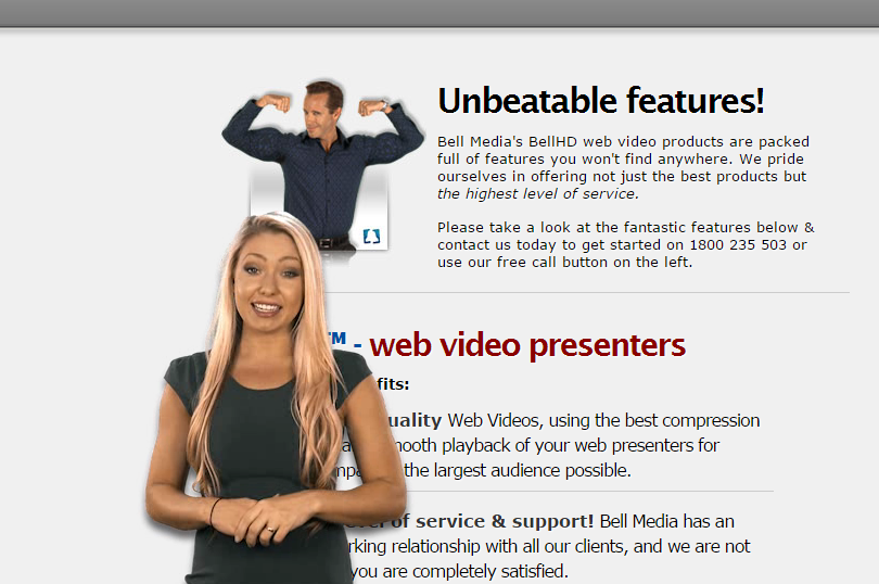
And here is another tip from our Senior Digital Marketer – forget about the walk on actors. This has no place in today’s website world. Though it may add an element of personality and humanism, it unfortunately mirrors the above, you just shouldn’t have an avatar on page. If you feel the need to incorporate video, just make sure that it is in a video box rather than walking all over the screen.
Again this is common practice in training modules, but it shouldn’t be the first thing someone sees when coming to your website.
The walk on actor…
11. Poor Design – no structure
If the backbone or architecture of a website is poorly designed, you’ll find that the time spent on page will be minor. If the structure is not intuitive and doesn’t allow visitors to easily navigate to the desired content, people will be turned off and look to an alternative site.
Every website needs to be user centric. Ultimately you must view the visitor’s time as valuable – and make sure you do the thinking for them. If a happy medium can be found between quality content and design and time on page, you’ll find that repeat visits will also eventuate. Alternatively, if you frustrate the user, they’ll close down the window and search elsewhere for answers.
12. Non-Mobile Friendly Websites
In 2015 it is entirely inappropriate for a website to be non-mobile friendly.
If there is one over-riding message that has come out of the online predictions for the coming year it is the absolute importance of providing an optimum experience for your users on mobile devices. Being the leaders we are, we are obviously proponents of Responsive Website Design (and even built a cool tool to allow users to test their sites on multiple devices - go on, give it a whirl). We never build a site without making it responsive - that is, making sure it adapts and displays perfectly on desktop and mobile devices – it’s just best practice these days.
If you have an existing website that is not yet responsive then, this year more than ever, you need to think about jumping on board the responsive boat with a redesigned website that will serve your mobile users in the way that they expect. And if you have been hiding under a rock lately, you should be aware that as of the 21st April Google has rolled out a tweak to its mobile search algorithm - essentially this means that if your website isn't mobile friendly, it overtime will not be returned as a search result by someone searching via a mobile device - a potential business killer, or at least a severe impact for business - particularly SMEs.
I strongly recommend you read Google's own blog around the change, and an earlier blog by Apex Digital (Karyn) which provides an overview of the the change and offers a number of external sources for further information.
- Google Webmaster Central Blog - Rolling out the mobile-friendly update
- Apex Digital - Important Google Mobile-Friendly Update Coming,
Keep an eye out for next month's Apex Digital blog where we take a more indepth look at the mobile change and its impact.
Not convinced? Then these articles might just provide the inspiration:
- SE Journal - Google Issues Warnings about Poor Search Rankings for Non-Mobile Sites
- SE Watch - Why a Mobile-Friendly Website Is Essential to a Successful SEO Strategy in 2015
We’ve predominantly only touched on the functionality and some of the assets of a homepage. It was quite timely that before publishing we stumbled across an article by Marcus Sheridan - 10 Web Design Mistakes that are Guaranteed to Create a Bad First Impression. Marcus details 10 design faux pas that are sure to feed into some of our dirty dozen discussions above, but by taking heed of these 10 identified design flaws in conjunction with the Dirty Dozen you’ll be winging your way to a great website in no time.
Conclusion
There are a multitude of different elements that we wouldn’t place on a webpage, and as time passes, these will continue to be added to as the evolution in technology, design, usability and those all-encompassing fads make themselves known.
This article outlines 12 elements that have provoked a response of distaste around our office. While some have and will be weeded out through natural attrition, others will take a shift in fundamental thinking and a requirement to embrace the current crop of new website development techniques and elements.
Photo credits:
Dirty Dozen, by Bunny Dojo
Sunset by Thangaraj Kumaravel, CC-BY-2.0
[1] http://planmysite.com/blog/advantages-and-disadvantages-of-flash-websites
Related posts


AWESOME! LET'S GET STARTED
TELL US HOW WE CAN HELP
We aim to respond to all messages within 1 business day. You'll be hearing from us soon!
In the meantime, perhaps you'd like to learn more...